
A brand video landing page is a single-goal page built around a branded video that persuades or demonstrates, aimed at one measurable action such as a sign-up, demo request, download, or donation. The one rule to follow: keep your core proposition and call to action visible and usable without anyone pressing play. The video should strengthen the page, never gate it.
TL;DR:
- More than 70% of video watch time happens on mobile, so use captions, on screen text, and visual storytelling that communicates the offer without sound.
- For high intent traffic, place an immediate conversion button beside a short promotional clip; cold social traffic needs proof and persuasion before its first ask.
- Reserve space for the video and load embedded players only after interaction; aim for a Cumulative Layout Shift score of 0.1 or less.
- Compare the video page with a control page without video, then judge qualified conversions, useful watch depth, speed, and results by device rather than play counts.
- Use muted autoplay only for decorative motion; persuasive videos with speech should start on click, and audio should never begin automatically.
Table of Contents
- What a brand video landing page is and why brands use one
- Types of video landing pages and when to use each
- Page structure and placement: where the video belongs
- Production and edit specs for brand landing videos
- Performance and accessibility best practices
- Examples and inspiration: annotated patterns to borrow
- How to measure, test, and optimize a brand video landing page
- What we prioritize when we build brand video landing pages
- Production, edits, and landing page delivery with our team
- FAQ
- Sources
What a brand video landing page is and why brands use one
A regular landing page leans on headline, copy, and images. A brand video landing page adds a video as the main persuasion device, then builds everything around it: the headline sets the promise, the video proves or dramatizes it, and the call to action asks for the next step. The page still has to work if the video never plays.
Marketers and designers reach for this format because it helps in practical ways:
- Faster comprehension. A concise demo can clarify a complex offer quicker than several paragraphs.
- Better persuasion for visual offers. Products, venues, programs, and services that people need to see are easier to sell on screen.
- Higher engagement. Motion and voice hold attention long enough for a visitor to reach the call to action.
- Accessibility and search gains. Captions and transcripts serve viewers who cannot use audio, and they give search engines readable text that describes the video. A video SEO guide covers indexing and organic reach in more detail.
- Stronger brand memory. Tone, faces, and pacing communicate who you are in a way a template layout cannot.
Mobile changes how you design the video itself, because most viewing happens on phones, often in public places with the sound off.
More than 70% of video watch time happens on mobile devices, according to Google's TrueView playbook. Plan every video to land its message without audio, using on-screen text, captions, and clear visual storytelling.
That one finding shapes the rest of this guide: silent-first editing, captions as a default, and a layout where the offer is readable before playback.
Types of video landing pages and when to use each
Pick the format from your goal and the intent of the traffic you send. A visitor who clicked a branded search is ready to act. A visitor from a cold social ad needs more persuasion first.
- Product demo. Shows the core flow of a product or service and shortens the evaluation stage. Pair it with a "Watch demo" button next to a primary conversion button. Our guide to product demo video production covers scripting and capture.
- Promotional hero. Builds emotion and awareness with a short, polished clip. If the traffic is high intent, put an immediate conversion button beside it. If it is cold, use the clip to earn the scroll.
- Testimonial or customer proof. Works best near the evaluation content, where doubt appears. A real customer answering one objection reduces friction more than any badge row. See how we approach client testimonial videos.
- Tutorial or walkthrough. Use it when seeing the steps is the value proposition, such as software setup, a service process, or a donation flow that people worry is complicated.
- Welcome or onboarding. Best after conversion, or in retention flows. A thank-you page with a short welcome from your team sets expectations and lowers early drop-off.
Many strong pages combine two types: a short promotional clip above the fold and a testimonial lower down. Just keep one primary action. If every video asks for a different thing, the page stops being a landing page and becomes a menu.
Page structure and placement: where the video belongs
The layout below works for most brand video landing pages. Build it first, then adjust for your audience.
- Headline and value line. State the outcome for the visitor in one sentence, then add one supporting line.
- Poster or short hero clip. Show a meaningful frame, not a random one, with a clear play control.
- Primary call to action. Visible above the fold, without pressing play, in the same viewport as the video.
- Proof. Place testimonials, logos, results, or a short case study lower on the page, where doubt shows up.
- Repeat the call to action after the proof, using the same wording so the action stays consistent.
- Secondary path. Add a "Watch the full video" or "Read the details" link for people who want depth.
Decide early between muted autoplay and click-to-play. Muted autoplay suits decorative motion, such as a looping atmosphere clip behind the headline. For persuasive content with a story, a spoken message, or a demo, click-to-play is the safer default: the visitor chooses to engage, sound works as intended, and you avoid distracting people who are trying to read. If you do autoplay, keep it silent, short, and non-essential to understanding the offer.
Protect the edges of the frame. Keep logos, burned-in text, and any on-video calls to action inside safe margins so small screens and player controls do not crop or cover them. Test on an actual phone, not just a resized desktop window.
Pro Tip: Cover the video with your hand and read the page. If the headline, value line, and button still tell a stranger what to do and why, the layout is ready.
Production and edit specs for brand landing videos
Hand these specs to your editor and developer before the shoot day, not after. Fixing them in post is slower and more expensive.
- Length. Aim for a concise runtime. Keep hero clips shorter and go longer only when the content truly needs it, such as a walkthrough. Our notes on promo video length explain how to choose.
- The hook. Google's video action campaign guidance recommends using the first 5 to 10 seconds to hook viewers and including a bespoke call to action. Open on the problem or the payoff, not on a logo animation.
- Responsive edits. When the subject or on-screen text would get lost on a phone, cut a vertical or square version alongside the widescreen master. Reframing in the edit beats cropping blindly in the player.
- Poster image. Choose a frame that communicates the subject, compress it for the web, and size it for the container so it can load quickly as the largest element on the page.
- Captions and transcript. Supply a reviewed caption file, not raw auto-captions, and publish a transcript on the page. Both help accessibility and give search engines text to read.
- Export renditions. Deliver web-optimized files with an appropriate codec and bitrate, not the production master. A heavy file slows the page and drains mobile data.
- Script structure. A reliable arc is hook, problem, solution, call to action, so the video answers one specific objection right after the headline.
Pro Tip: Ask your editor to deliver three things in one handoff: the web video, the caption file, and the poster frame. It saves a round of revisions and keeps the page launch on schedule.
Performance and accessibility best practices
A beautiful video that makes the page jump or stall costs you conversions. These rules keep the page fast and usable.
- Reserve space. Give the video or poster a fixed aspect ratio so nothing shifts when it loads. Embeds and iframes without dimensions are a common cause of layout shifts.
- Defer third-party players. Embedded players can block the main thread. Show a placeholder and load the real player only after interaction, as Web recommends.
- Use lazy loading and facades. The poster attribute works as a lightweight placeholder, and facades such as lite-youtube avoid loading heavy player code upfront, as covered in Web. Our write-up on fast, accessible video embeds includes production-ready code.
- Respect autoplay rules. Muted autoplay can work for decoration. For persuasive content, use click-to-play, never start audio automatically, and honor reduced-motion preferences.
- Make controls accessible. The play button must work with a keyboard, captions should be available, and a transcript plus a short written summary should sit near the video.
- Instrument everything. Track play, useful watch depth, and completion, then compare them with a no-video control.
Aim for a Cumulative Layout Shift score of 0.1 or less, and treat anything above 0.25 as poor, according to Web. Fixed aspect ratios and placeholders for video elements are the simplest way to stay under that line.
A practical habit: have your developer test the page with the video blocked or slow. If the offer and button still render cleanly, you have built it right.
Examples and inspiration: annotated patterns to borrow
Treat these as templates rather than finished pages. Each names the hook, the placement of the call to action, and what the video shows.
- Hero demo pattern. The hook is a one-line outcome headline. A short clip sits beside the headline, showing the product doing its single most valuable task. The call to action sits directly under the headline, and a "Watch demo" link opens the longer version. Adapt the tone by changing the pacing: brisk cuts for a software brand, slower and warmer shots for a service organization.
- Testimonial-led pattern. The hook is a customer quote used as the headline. The video is one person describing the problem, the turning point, and the result in a concise clip. The call to action follows the video and repeats lower down after the proof section. This pattern fits high-consideration offers where trust matters most.
- Product tour pattern. The hook is a promise to show how something works in a fixed time. The video walks through three steps with on-screen labels, and chapters or a transcript let people skip ahead. Put the call to action at the end of the tour and again in the page footer area.
- Story-first brand pattern. The hook is a human moment rather than a feature. The video builds emotion and ends on an invitation, such as a donation, signup, or inquiry. We use this approach for mission-driven organizations whose audience gives because of how they feel.
To turn any example into a reusable template, lock the structure and swap the content. Fix the headline slot, video slot, button slot, and proof slot. Write down the poster size, caption requirements, and target runtime. Then each new campaign needs only a new script, a new video, and a new headline, not a new design process.
For high-intent traffic, shorten the path: smaller video, bigger button. For cold traffic, lengthen the persuasion: longer proof, softer first ask.
How to measure, test, and optimize a brand video landing page
Without a plan, a video page can look successful while hurting results. A play count tells you very little. Use this checklist to see what actually moves outcomes.
- Conversion rate on the single goal action, the metric that decides everything else.
- Useful watch depth, meaning how much of the video people watch before acting, not how many pressed play.
- Page speed and stability, tracked through Largest Contentful Paint and Cumulative Layout Shift.
- Bounce rate and lead quality, since a rise in sign-ups that never turn into customers is not a win.
Run tests in this order:
- Start with a no-video control. Send part of your traffic to the same page without the video, so you know whether the video helps at all.
- Test the poster and the call to action wording, since these are cheap changes with real impact.
- Compare autoplay and click-to-play in separate segments, with muted autoplay only where it fits the content.
- Test video length, such as a shorter cut against a longer cut.
- Make a decision rule before you start: adopt the video only when the result is statistically reliable and the lift in qualified conversions is large enough to matter in practice.
Name your events consistently, for example video_play, video_50_percent, and cta_click, and segment results by device and by traffic intent. A video that wins on desktop and loses on mobile is common, and a blended average hides it. For the strategy behind the numbers, our guide to video content strategy ties each video to one outcome.
What we prioritize when we build brand video landing pages
Most landing page video fails for a simple reason: the video tries to say everything. We start by asking what one question the video answers for this visitor, then we cut every shot that does not serve that answer and tie the ending to a single call to action. A focused video beats a polished, lengthy brand film nearly every time.
We also refuse to treat creative quality and performance as opposing goals. Our workflow builds the poster, the caption file, and the lazy-loaded facade into production from the first day, so the page stays quick even on a phone with a weak connection. The beautiful frame and the fast load are the same project.

Our work with organizations such as KVC and NorthPoint Development reflects this approach: clear storytelling that supports outreach and fundraising goals, delivered on time. Your situation will differ, so we start by learning your audience before we propose a format.
If you want a quick starting point, run this audit on your current page: Is the offer readable without playback? Is there one call to action? Does the video have captions and a transcript? Is space reserved so nothing shifts? Four yeses means you are ahead of most pages. A no on any of them is where we would begin in a discovery call.
— Bo
Production, edits, and landing page delivery with our team
If you would rather hand this off, we handle the full chain: scripting and shooting the video, cutting the web and vertical versions, preparing captions and posters, and building the page that carries it. Our services include video production, web builds, content retainer packages for teams that need a steady stream of new clips, and livestreams for events that deserve a live audience.
A first project usually begins with a short conversation about your goal, your audience, and where the traffic comes from. From there we propose one video, one page structure, and one measurement plan, so you know what success looks like before we shoot anything. Current pricing details are on our website.
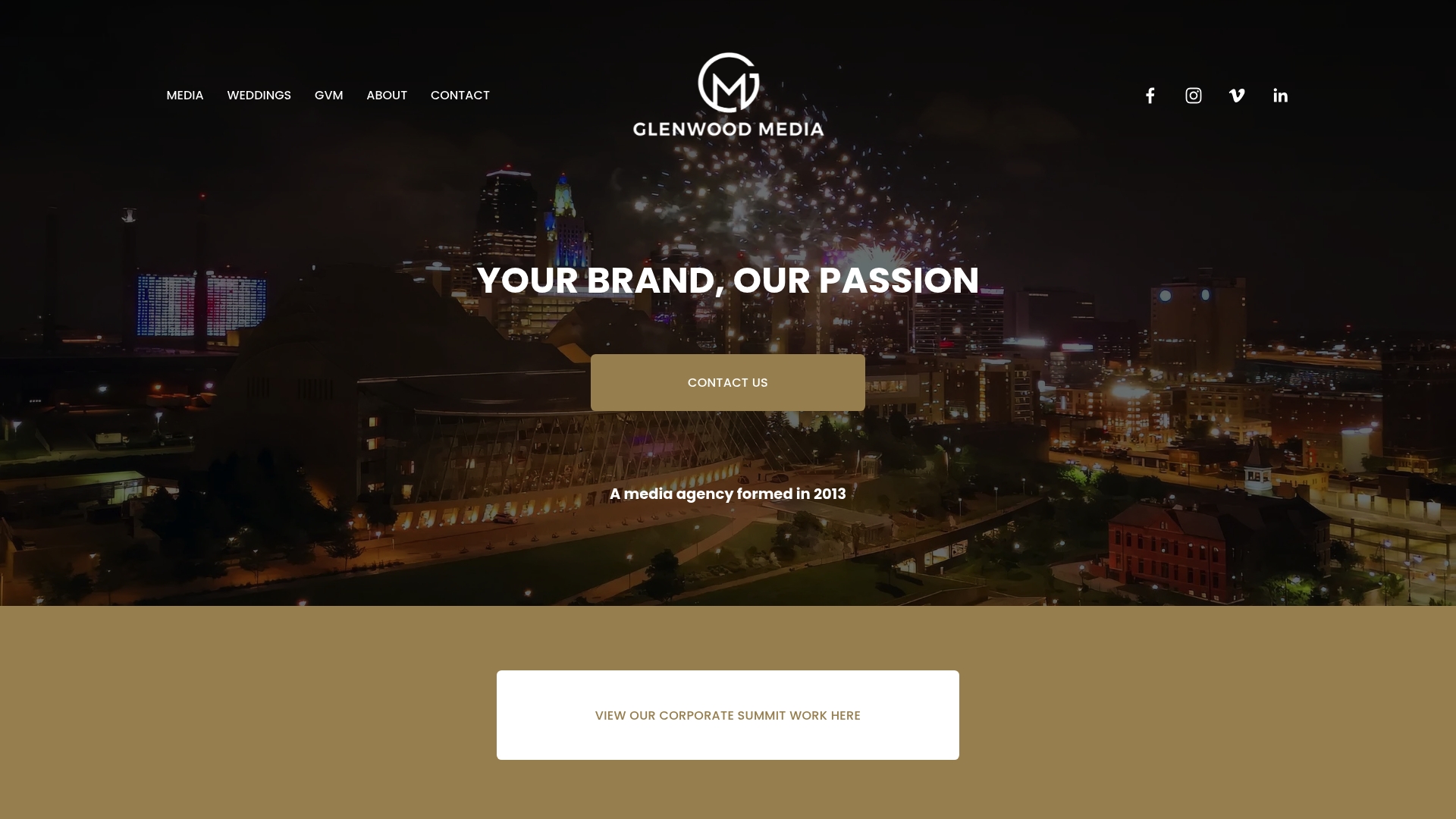
Ready to turn your story into a page that converts? Request a quote through our video production page, and we will respond with a plan built around your goal.
FAQ
How long should a landing page video be?
Most brand landing page videos work best when concise, with an even shorter runtime for a hero clip. Go longer only when a walkthrough or demo truly needs it, and offer a "Watch demo" button for viewers who want more depth.
Should a landing page video autoplay?
Muted autoplay is fine for decorative motion, but persuasive videos with a spoken message are safer as click-to-play. Never start audio automatically, and respect reduced-motion preferences so you do not distract or exclude visitors.
Does video on a landing page hurt page speed?
It can if the player loads eagerly. Embedded third-party players can block the main thread, so use a poster placeholder and load the real player only when someone interacts with it. Reserving fixed space also prevents layout shifts.
How do I know if my landing page video is working?
Compare it against a no-video control and judge it on conversions and qualified leads, not plays. Watch depth, page speed, and results split by device give you a clearer picture than any single average.
Do I need captions and a transcript?
Yes. Captions let people watch without sound, which matters on mobile, and a transcript gives search engines and assistive technology readable text. Use reviewed captions rather than raw auto-generated ones.